There are some pros and cons to our redesign choices… And we have many ideas for future work.
Pros
We tackled the most urgent problems, most notably, the lack of hierarchy and organization. Links and information should be organized in a clear, intuitive way. Previously, information was scattered all over the place.
The tagline allows users to determine where they are and what the organization is all about, as soon as they land on the page.
Consistency between the homepage and secondary pages makes the overall site more cohesive, credible, and learnable. It fits into a system that people can naturally more easily navigate.
Cons
Mobile responsiveness is important, but this is not something that we could budget for at this stage. The redesign can go much further in addressing this element. However, it might be easily tackled if the design was responsive overall. For example, if it is considered in the redesign for desktop that content should wrap/stack when the browser window shrinks, the site will be a few steps closer to being mobile responsive, too.
The gallery needs a lot of attention and is not currently being addressed. However, this will be a fairly easy fix. On the other hand, we may cover some of this aspect in the overall design consistency process. That is, we can make the size and shape of the gallery photos match those on the home page.
There are many ways to categorize the necessary information. We would like to do a few user studies, perhaps with card sorting, to suss out the exact categorizations and subcategorizations of information.
Following is a series of prototypes for the first redesigns that we have just discussed.
Home Page
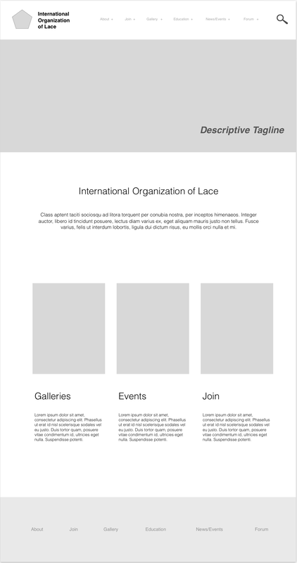
This redesign has a tagline and a space for a better image that spans the top so that users know where they are right away when they arrive on the page. There is an area for a shortened description of the site just below the banner. In addition, there are areas for "callout" buttons, which highlight areas of particular interest that users can click on to access different parts of the site. Clearly defined hierarchy based on standard design conventions helps users decide where to look when they scan the site. Having a menu across the top is where most users will look when searching for information.
Design Consistency + Hierarchy for Visuals and Information
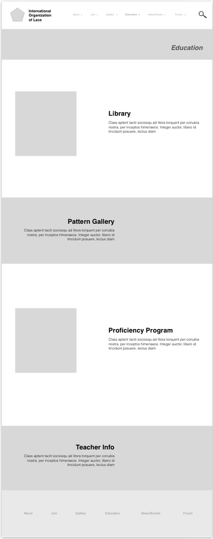
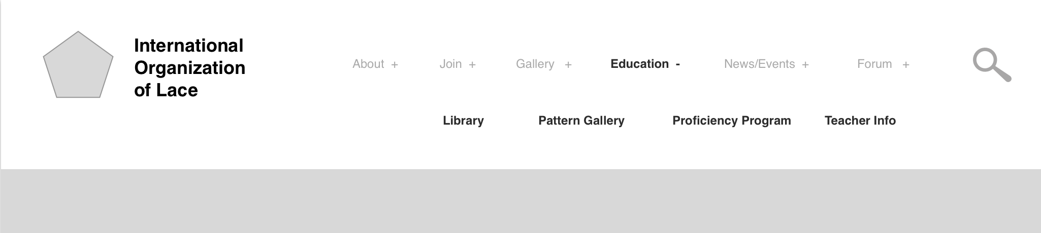
The menu on the top and the bottom of the page “follows” the user throughout the site and stays the same, providing a sort of anchor for users as the move throughout. There is also a banner at the top of all sub pages, which will have a place for lace imagery, letting users know they are still on the same site. At the same time, the banner is thinner on each sub page, giving a sense of structure and hierarchy to the site that this is a secondary page, not the home page. Each sub page will be a landing page for the categories our group has decided on - Education, Events, etc. From here, users will be able to scroll down to find a link to each third tier site. For example, Library in this iteration is categorized under Education, so when the user clicks Education they can then click through to library. This will also show up, as seen in the screen shots below, in the main menu. This contributes to an overall visual and information hierarchy of the site.
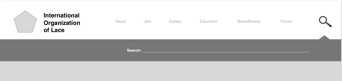
Menu Information Options
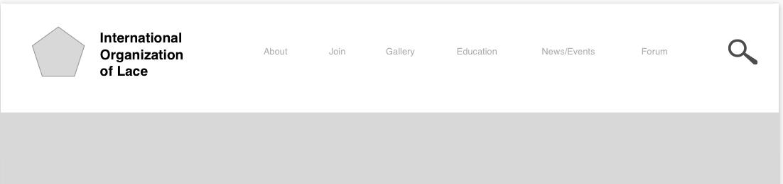
There are essentially two different information organization options in regards to menu organization. You can see the two options below. Option 1 - has fewer items but is more densely organized and looks a bit cleaner.
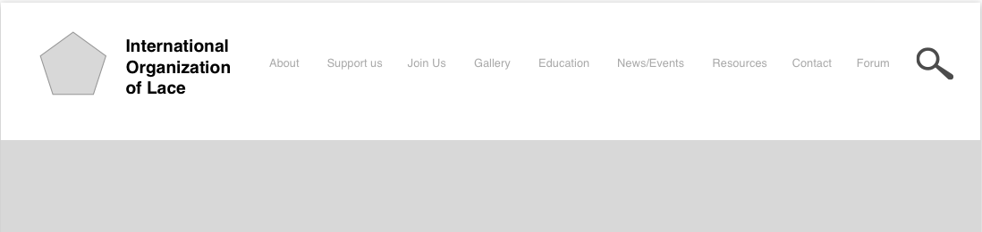
Option 2 - has more items, but is bit more crowded.
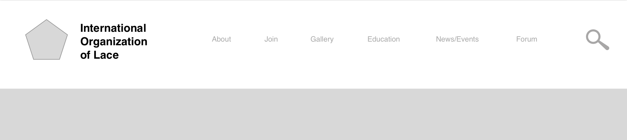
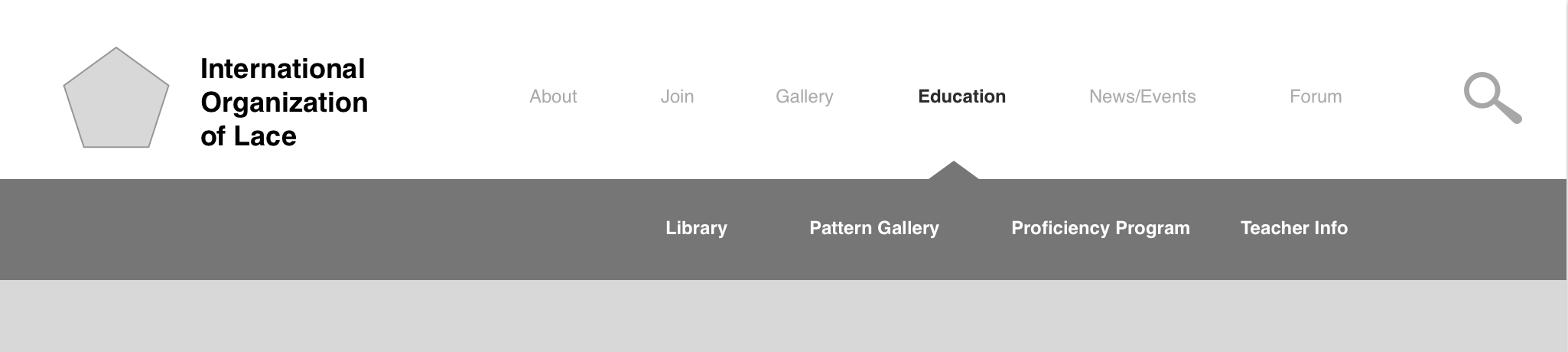
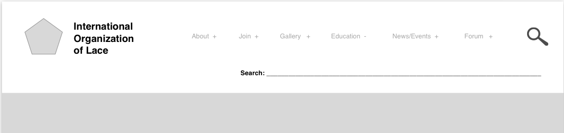
Menu Drop Down
Included in the visualization of the site, there are two different design options for the menu drop down. This is for the desktop and not the mobile site. In addition, if there is room in the budget, a search option for the whole site will be included. When the user hovers over one option, information pops up below, in two different versions. In each version, the relevant category becomes bolder when it is selected.