Following are the final redesigns for the IOLI website. Most are iterations of the prototypes we developed for our main issues, largely involving the poor dialog of the home page, the lack of design consistency and hierarchy for visuals and information, the poor global navigation, and the lack of mobile responsiveness. Included now, also, are prototypes for the gallery main page and search feature. These final iterations are based on a series of user studies and peer feedback.
To supplement the following explanations of our final redesign suggestions, please see the series of full redesign processes and rationales detailed in our user studies, usability analysis, initial redesign rationale, initial redesign visualizations, and responses to feedback. Please send us a message if you have any questions or concerns.
To supplement the following explanations of our final redesign suggestions, please see the series of full redesign processes and rationales detailed in our user studies, usability analysis, initial redesign rationale, initial redesign visualizations, and responses to feedback. Please send us a message if you have any questions or concerns.
Home Page
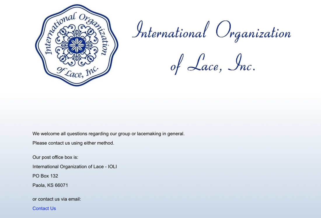
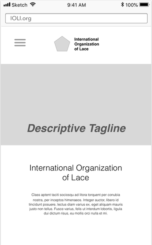
In his book Don’t Make Me Think, Steve Krug says that the most important part of a website’s home page is its ability to convey the big picture, or, simply, what the site is for. Per our user studies, the original IOLI home page did not meet this criterion. Also, the photo selected to represent the organization did not lend for much credibility. Further, the initial home page made it so that users had to consistently return to it in order to navigate to other areas of the site, increasing work due to unnecessary backtracking. On it, there were many menu labels to choose from, all visible at once. Cognitive load was high. The site’s purpose was unclear, especially because the organization itself is not a household name.
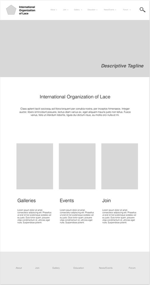
Our final redesign of the home page eliminates these problems. We first updated the home page by establishing style consistency between it and the secondary pages (as shown below), which makes the overall site more cohesive, credible, and learnable. This redesign includes a tagline and a space for a more representative, higher quality image that spans the top so that users know where they are, and what they can do on the site, right as they land on the page. The newly added tagline serves a similar purpose, allowing users to quickly determine where they are, what the organization is all about, and what benefit they stand to gain. There is an area for a short description of the site just below the banner. In addition, there is space for "callout" buttons, which highlight areas of particular interest that users can click on to access different parts of the site. Clearly defined hierarchy based on standard design conventions helps users decide where to look when they scan the site. Having a menu across the top is where most users will look when searching for information. We retain the top navigation on secondary, tertiary, etc. pages of the site.
As prototyping progressed, other home page iterations retained the clarity and simplicity of the initial redesign of the home page. Throughout the process, out redesign retained the original page’s ability to see most content with minimal scrolling. We simply eliminated the need for users to constantly return to the home page to follow a predetermined path, or find desired information, an outdated method that was a prominent issue during our user studies. This original simplicity, plus the added incorporation of better images, a tagline, and a fresher style, makes the final more usable in that the user can better grasp what the site and organization are about, and complete a task or function, all without added work.
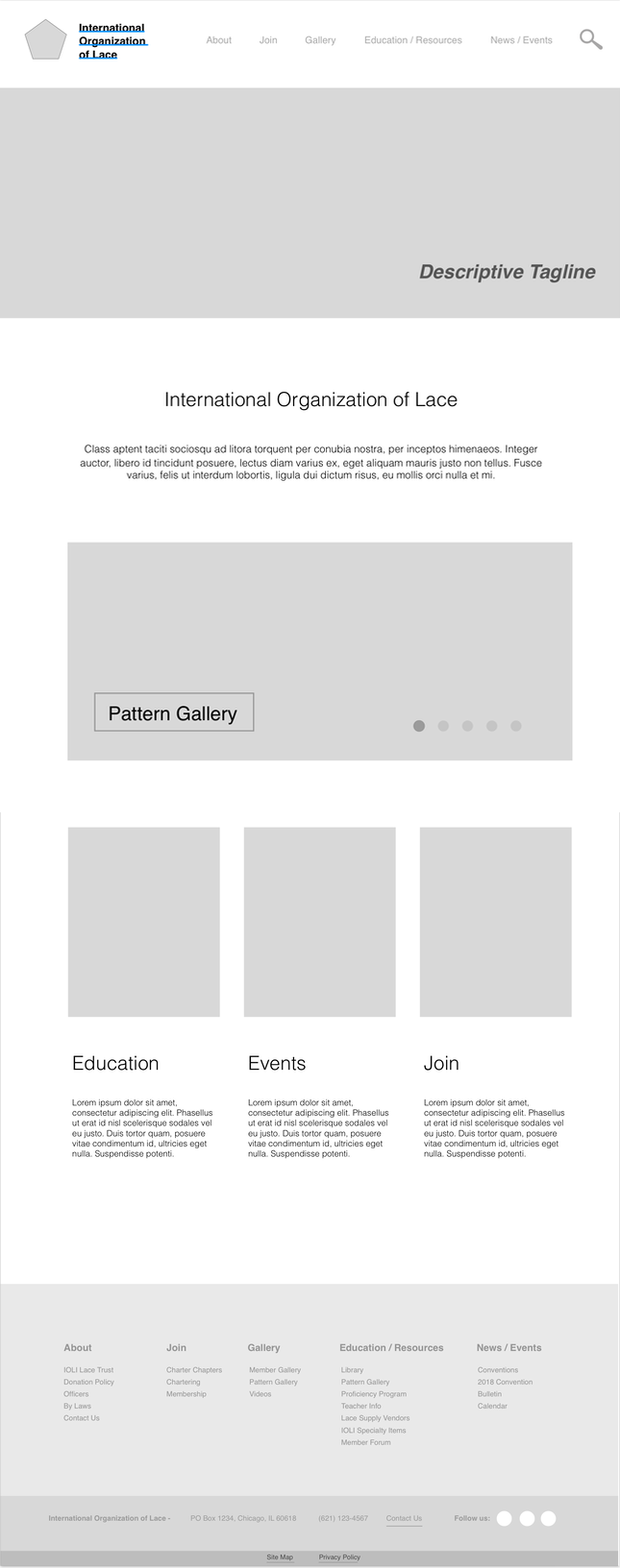
Though much of the home page remained consistent throughout the redesign process, one of our newer iterations shows images of the members' designs in a slideshow, and each image links to the respective pattern. (Relatedly, see the completely newly prototyped gallery redesign below.) We removed the Contact tab, included a contact link in the About tab, and added the contact information to the footer. Per peer feedback, we kept callout buttons on the site and moved the gallery button above into a rolling slideshow.
Our final redesign of the home page eliminates these problems. We first updated the home page by establishing style consistency between it and the secondary pages (as shown below), which makes the overall site more cohesive, credible, and learnable. This redesign includes a tagline and a space for a more representative, higher quality image that spans the top so that users know where they are, and what they can do on the site, right as they land on the page. The newly added tagline serves a similar purpose, allowing users to quickly determine where they are, what the organization is all about, and what benefit they stand to gain. There is an area for a short description of the site just below the banner. In addition, there is space for "callout" buttons, which highlight areas of particular interest that users can click on to access different parts of the site. Clearly defined hierarchy based on standard design conventions helps users decide where to look when they scan the site. Having a menu across the top is where most users will look when searching for information. We retain the top navigation on secondary, tertiary, etc. pages of the site.
As prototyping progressed, other home page iterations retained the clarity and simplicity of the initial redesign of the home page. Throughout the process, out redesign retained the original page’s ability to see most content with minimal scrolling. We simply eliminated the need for users to constantly return to the home page to follow a predetermined path, or find desired information, an outdated method that was a prominent issue during our user studies. This original simplicity, plus the added incorporation of better images, a tagline, and a fresher style, makes the final more usable in that the user can better grasp what the site and organization are about, and complete a task or function, all without added work.
Though much of the home page remained consistent throughout the redesign process, one of our newer iterations shows images of the members' designs in a slideshow, and each image links to the respective pattern. (Relatedly, see the completely newly prototyped gallery redesign below.) We removed the Contact tab, included a contact link in the About tab, and added the contact information to the footer. Per peer feedback, we kept callout buttons on the site and moved the gallery button above into a rolling slideshow.
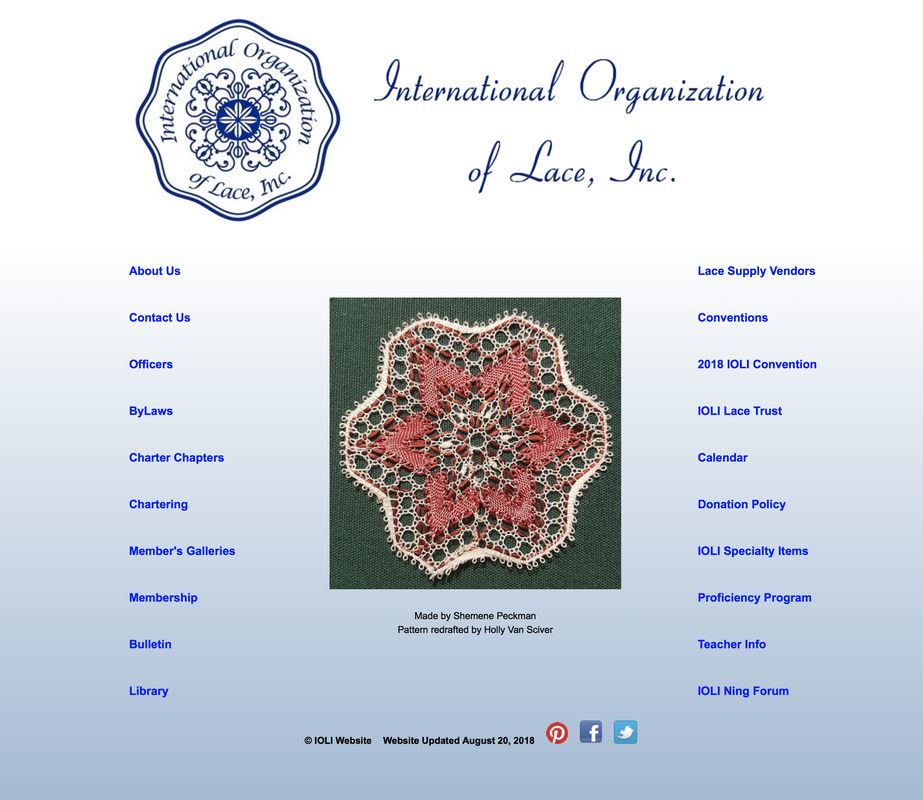
Original Home Page
First Home Page Iteration
|
Final Home Page
|
Consistency + Hierarchy
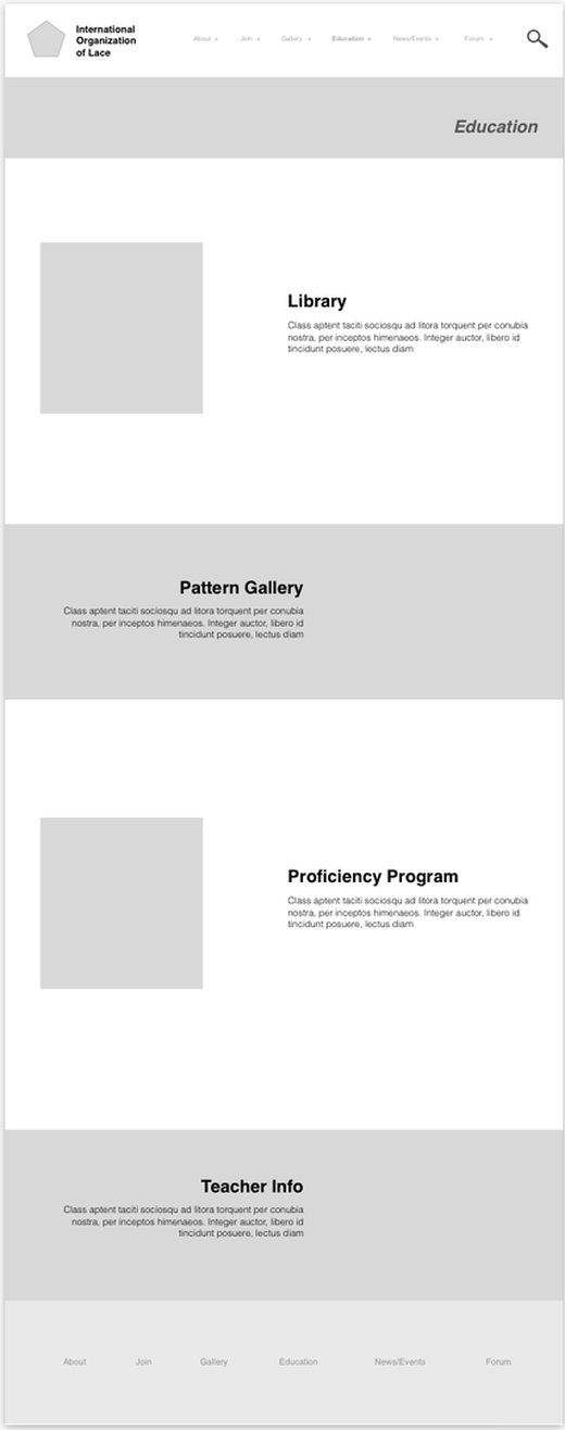
The original site included differing amounts of useful information on each subpage/secondary document. There was no rhythm between pages, making it difficult for users to learn and decipher a hierarchy within or across pages, or pick out important details. Since information was scattered across pages ineffectively, we ensured that links and information were organized in a clear, intuitive way. As noted above, consistency between the home page and secondary pages makes the overall site more cohesive, credible, and learnable. It fits into a system that people can naturally and more easily navigate.
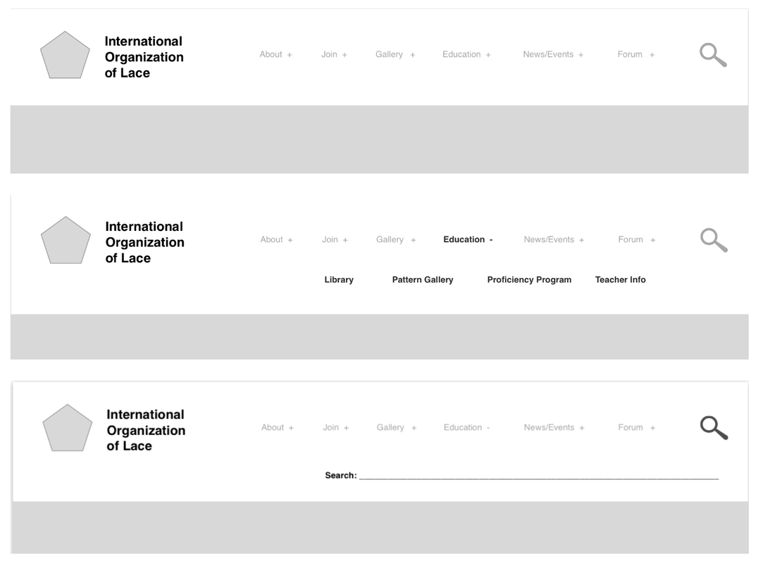
For the first iteration, the menu on the top and bottom of the page “follows” the user throughout the site and stays the same, providing a sort of anchor for users as they move throughout the site (see more on this topic in the Menu discussion below). There is a banner at the top of all subpages that has a place for lace imagery, a visual method of letting users know that they are still on the same site. At the same time, the banner is thinner on each subpage, giving a sense of structure and hierarchy to the overall site—for example, “this is a secondary page, not the home page.” Each subpage will be a landing page for the umbrella categories our team selected—About, Join, Gallery, Education/Resources, and News/Events. From here, users are able to scroll down to find a link to each third tier site. For example, Library is housed under Education/Resources, so when the user clicks Education/Resources, they can then click through to Library. This will also show up within the main menu, contributing to an overall visual and information hierarchy for the site.
User feedback was consistent with our initial design choices, so we stuck with much of our original suggestions that were just described. The incorporation of cross-page functionality for better global navigation, eliminating the need for users to constantly return to the home page to follow a predetermined path, was well received. A more recent iteration included the addition of breadcrumbs for when the user starts getting into the subpages of the site. This, along with the menu, is now included on all pages, for consistency, yes, but also for orientation. Finally, as can be seen from the this discussion and the remainder of the site prototypes, a single “template” is used across all pages. From now on, there will be titles and sections on each pages, with similar font styles, colors, and sizes, in addition to steady text and image spacing and layout, which were all previously inconsistent.
All of these design choices fit with Nielsen's "Aesthetic and Minimalist Design" heuristic, which states that reducing visual noise and categorizing information helps users make sense of the task at hand.
Original Consistency + Hierarchy 1
Original Consistency + Hierarchy 2
|
First Consistency + Hierarchy Iteration
|
Navigation
The original IOLI website did not have navigation that follows a user throughout the site. This made navigating the site time consuming and difficult because the user was required to go back to the home page if they wanted to look at another subpage. This back and forth was an obvious issue during our user studies, as we watched our users continuously revert back to the home page in order to complete their tasks.
We also noted that there were too many options—static ones at that—on the original home page, with no descriptions of what information the pages link to. The initial IOLI home page created many questions for users such as “Where am I?” and “Where should I begin?” These are signs of cognitive overload. In Krug’s Don’t Make Me Think, Chapter 1 discusses why users should not spend time on this type of “mental chatter.” Krug states that “every question mark adds to our cognitive workload, distracting our attention from the task at hand” and that if the creator of a site does not spend the time to make the site easy to use, it can erode the confidence a user has in the organization. The amount of links on the original IOLI home page can cause cognitive overload for a user; there was no direction on where to go for information, which will slow users down.
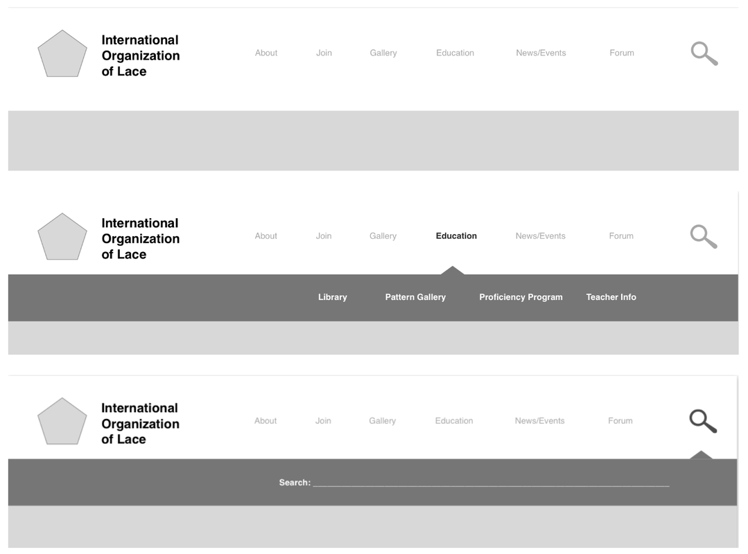
With these issues in mind, our team created a top navigation menu that is easy and convenient for users of the site. The first problem we solved was condensing the number of initial options users had after they landed on and examined the home page. We used a method similar to card sorting to develop a few main categories and then sorted the remaining subpages into those umbrellas. Each category became a subpage, noted on the main navigation bar, with a drop down menu showing what information can be found on that subpage. We feel that the use of a drop down menu on the main navigation bar was the best option to make available as much information as possible while still reducing the overwhelming feeling of the original home page. This new menu format also enables users to navigate directly to a page in one-click, finding information with less effort. This global navigation menu, follows users throughout the website and eliminates the requirement of returning to the home page when a new set of information is desired. Our new redesign also follows Nielsen's "Recognition rather than Recall" heuristic, which states that users shouldn't have to remember information to use the interface, they should be able to tell by looking at it. Our new design doesn't force users to think about which information belongs where. It's already been decided for them through the new categories.
The navigation bar with the drop downs received positive reviews from our peers, so we kept the design. Of the two options initially presented, our peers voted for the option with a contrasting subpage menu as the most user friendly. If we were able to do another user study, we would have the users do an actual card sorting exercise to ensure each subpage is in a category that makes sense to IOLI users, and address category headings that are unclear or not useful. A newer addition to our navigation was breadcrumbs, which was at the recommendation of one of our peers. We thought this was a great suggestion for enhanced user orientation within the site and added it to the final global navigation recommendation.
We also noted that there were too many options—static ones at that—on the original home page, with no descriptions of what information the pages link to. The initial IOLI home page created many questions for users such as “Where am I?” and “Where should I begin?” These are signs of cognitive overload. In Krug’s Don’t Make Me Think, Chapter 1 discusses why users should not spend time on this type of “mental chatter.” Krug states that “every question mark adds to our cognitive workload, distracting our attention from the task at hand” and that if the creator of a site does not spend the time to make the site easy to use, it can erode the confidence a user has in the organization. The amount of links on the original IOLI home page can cause cognitive overload for a user; there was no direction on where to go for information, which will slow users down.
With these issues in mind, our team created a top navigation menu that is easy and convenient for users of the site. The first problem we solved was condensing the number of initial options users had after they landed on and examined the home page. We used a method similar to card sorting to develop a few main categories and then sorted the remaining subpages into those umbrellas. Each category became a subpage, noted on the main navigation bar, with a drop down menu showing what information can be found on that subpage. We feel that the use of a drop down menu on the main navigation bar was the best option to make available as much information as possible while still reducing the overwhelming feeling of the original home page. This new menu format also enables users to navigate directly to a page in one-click, finding information with less effort. This global navigation menu, follows users throughout the website and eliminates the requirement of returning to the home page when a new set of information is desired. Our new redesign also follows Nielsen's "Recognition rather than Recall" heuristic, which states that users shouldn't have to remember information to use the interface, they should be able to tell by looking at it. Our new design doesn't force users to think about which information belongs where. It's already been decided for them through the new categories.
The navigation bar with the drop downs received positive reviews from our peers, so we kept the design. Of the two options initially presented, our peers voted for the option with a contrasting subpage menu as the most user friendly. If we were able to do another user study, we would have the users do an actual card sorting exercise to ensure each subpage is in a category that makes sense to IOLI users, and address category headings that are unclear or not useful. A newer addition to our navigation was breadcrumbs, which was at the recommendation of one of our peers. We thought this was a great suggestion for enhanced user orientation within the site and added it to the final global navigation recommendation.
Original Navigation
First and Final Navigation Iteration 1
|
First Navigation Iteration 2
|
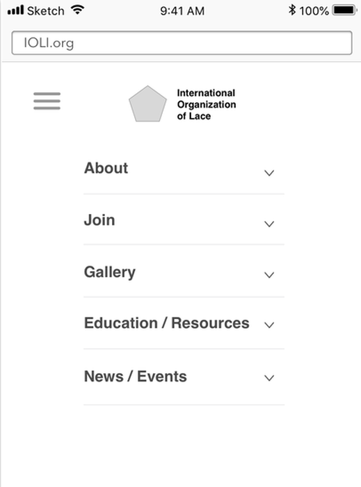
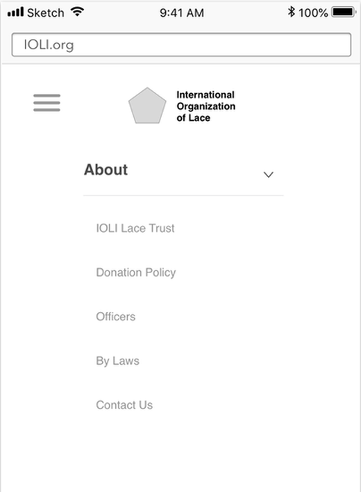
Mobile
The current IOLI website does not show well on a mobile platform. The site is exactly the same as the computer version, only smaller. This makes it difficult for users to navigate, as they are constantly enlarging and shrinking the page to read and navigate through the subpages. The lack of navigation is very apparent on this platform.
Our team decided to include this redesign suggestion during the second round of prototyping, after feedback from one person who stressed the importance of responsive mobile design. We added a “hamburger” menu for mobile navigation; it is a very common type of menu that users will be familiar with when they see it. The mobile menu design fits within Nielsen's "Consistency of Standards" heuristic, which states that it is easier for users to stick with a design standard. When the hamburger menu is opened, it will allow users to expand a subpage menu if they want to explore it and then contract the subpage menu when they are done.
We did not have time to design subpages for the mobile platform, but ideally code for the site would be written for fluid CSS. The text and images would flow and resize appropriately, and each page would become more linear to accommodate the narrow screen of a mobile system.
Original Mobile Home Page and Navigation
|
Final Mobile Home Page
|
Final Mobile Navigation 1
|
Final Mobile Navigation 2
|
Gallery + Gallery Search
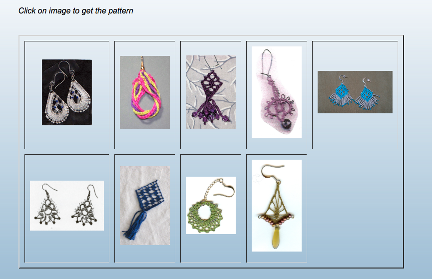
We had a bit of time left to include a new redesign suggestion pertaining to the gallery. On the original site, the "gallery" link on the home page brought you to a list of links, options including "member lace photos," "earring patterns," or "members patterns." Clicking on one of these options would take you to a gallery—a table of images without captions, descriptions, or any identifying information. That information only became available after clicking through each individual image.
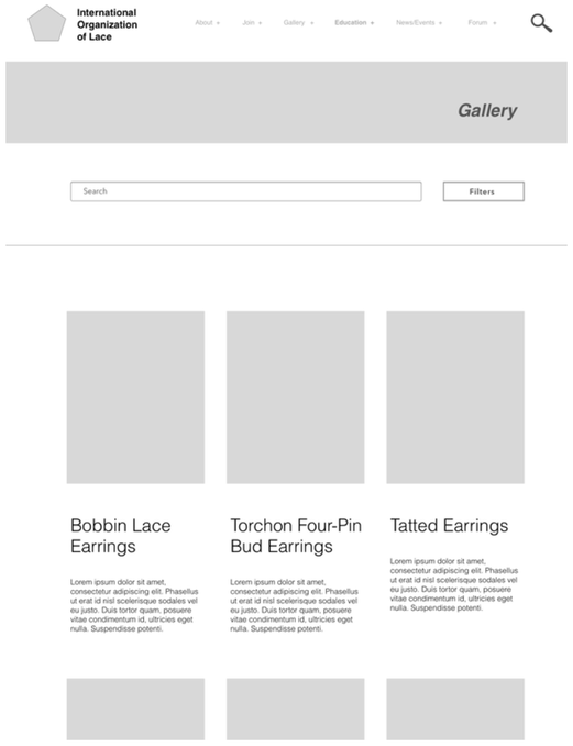
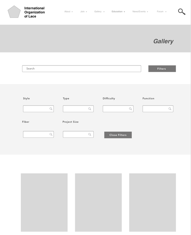
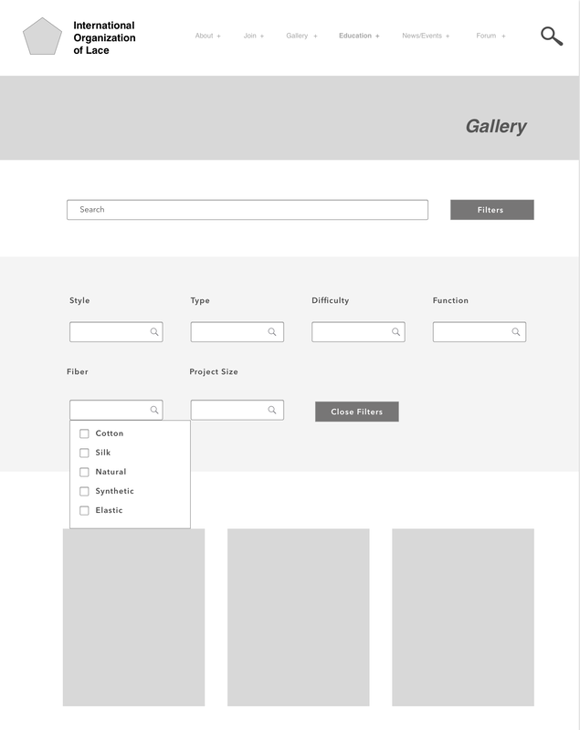
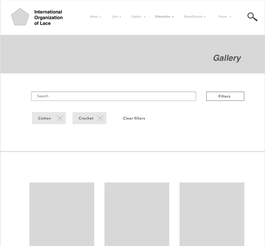
On the redesign, the overall layout has been simplified to a grid system with a description below each image, rather than a table. Now, all images are listed on the same gallery instead of as three separate galleries, as the initial distinctions were unclear and seemed to overlap. In order to filter results, users now have a search option. At the top of the site, there is a search bar; users can type what they are looking for right into the search. There is also the option of clicking on filter feature, which expands to show a suite of different options. In addition, when a user clicks on the "filters" button, it becomes darker to indicate that it is selected.
When users click on the various filters, there are radio buttons that can be used to select various options. We do not have wireframes for every single option, but our new categories are:
- Style (Venise, French, edging, insertion, allover/net, Chantilly, applique, Swiss entredeux, crochet, tatting, tassle, ribbon pass, smocked, gathered, ric rac)
- Type (Hairpin, Bobbin, Knit, Other)
- Difficulty (easy, medium, hard)
- Function (household, wearable)
- Fiber (cotton, silk, natural, synthetic, elastic)
- Project size (small, medium, large)

Original Gallery Page
Original Gallery
|
Final Gallery Page
|
Final Gallery Search with Filters 1
|
Final Gallery Search with Filters 2
|
Final Gallery Search with Filters 3
|
Review
Given the original product, we are confident that all of our design recommendations are strengths; all recommendations improve the site so drastically that weaknesses are negligible. Perhaps the only tradeoff is familiarity - users may have grown accustomed to the old site interface. However, the redesign, with its learnability and ease of use, is expected to ward off any negative perceptions by previous users.
Throughout the entire design process our team kept in mind Chapter 3 of Task-Centered User Interface Design by Clayton Lewis and John Rieman. This chapter discusses the need for intelligent borrowing when designing a website. The authors talk about different ways a designer should borrow features from other websites, suggesting familiarizing yourself with how these features interact with the website in order to choose the best one to suit your users. Since the IOLI website does not offer much for modern features, we were able to intelligently borrow many features to create a more familiar and functional website such as the navigation menu, search function, image gallery, and a "hamburger" menu for the mobile version.
In the future, we would like to do another formalized user study with discussion to confirm that the redesign presented here is indeed more appropriate than the original, and perhaps bring to light any other clear, offending elements.
Interestingly, some design issues, like textual clutter and poor aesthetics, were addressed secondarily; though not one of the main issues identified, they were made better in the process of fixing the main issues. For instance, as a result of our navigation redesigns, we were able to create a minimalistic feel for the IOLI website and give it better aesthetics. The new navigation removed the potential for cognitive overload by categorizing the main links which, in turn, gave us room to add a picture gallery and highlight some of the more important links to make the main page pleasing to users. Additionally, the new search option on the navigation menu will help users find their local charter or library materials, which is also something that should be addressed in detail with future redesigns.
Along those lines, we would recommend another user study and have users do an actual card sorting exercise to ensure that these new search functions and the card sorting exercise benefit the users. The members of our group are not lace creators or enthusiasts so it is difficult for us to predict which page is the most useful and what information the users of the IOLI site are looking for. It is likely that some information is not needed or can be further combined with other information to create an even more minimalistic feel for the website.
We do not have the capacity at this time to redesign subpages for mobile. Ideally, the code would be written to create a fluid CSS layout so that the objects can collapse and expand. In future iterations, more user testing and wire-framing will be necessary to optimize mobile versions on top of the fluid CSS layout.
