Response to Critiques
What people liked that we are sticking with
We received many comments in agreement with our initial redesign choices. Following is an overview of these notes with brief details on why these initial choices will be left as is in our subsequent iterations.
We received many comments in agreement with our initial redesign choices. Following is an overview of these notes with brief details on why these initial choices will be left as is in our subsequent iterations.
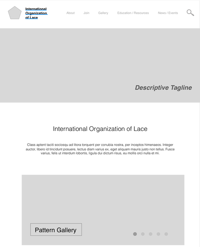
- One person noted that they appreciated that we kept the home page clear and simple. Our redesign retained the original’s ability to see most all content with minimal scrolling. With our redesign, this original simplicity, plus the added incorporation of better images, a tagline, and a fresher style, the user can better grasp what the site and organization are about, all without added work.
- We received positive feedback on our minimalist aesthetics. We made sure to omit irrelevant content in order to avoid competition with the vital page elements. The new design, though simpler, arguably presents more useful information.
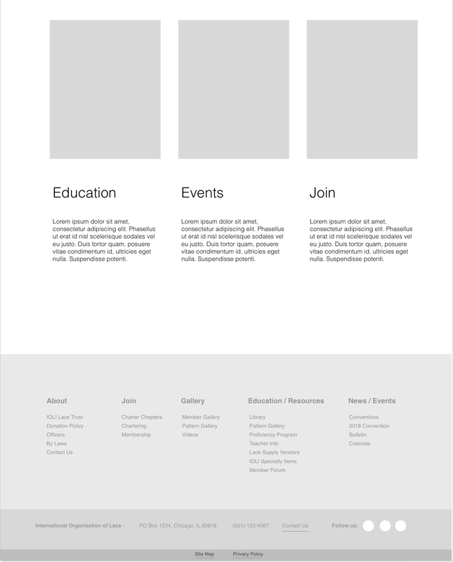
- Most comments suggested that we stick with our first set of suggested menu options. People noted that having fewer menu categories will be both cleaner and more manageable for users. This choice was also our favorite, and given this feedback and our lack of time for additional studies to test the menu options, we will use this first set of menu categories in future iterations.
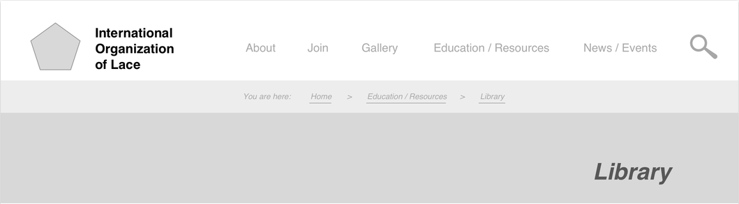
- Regarding navigation, there was a clear agreement that Option 1, with the use of contrast, is the better choice for helping users identify where they are in the site. We felt the same way from the get go, so we will be suggesting this option for future iterations.
- Multiple people noted their appreciation of our incorporation of cross-page functionality for better global navigation, eliminating the need for users to constantly return to the home page to follow a predetermined path, or find desired information, an outdated method that was a prominent issue during our user studies. One person even called the original site “unusable,” saying that “it is a little bit like lace I guess: interesting to look at but I'm not exactly sure what to do, so I just don't touch anything” to strengthen their argument that our suggested redesign for this matter is appropriate. Perhaps the most notable redesign element that we are retaining in this regard is having the top navigation carry over to secondary, tertiary, etc. pages of the site.
- Feedback regarding the linking of lace patterns and gallery images was positive. This is a straightforward, needed update, especially given the perceived wants and needs of the site’s audience, so this will carry over to future iterations.
- Interestingly, we also received feedback on our back-end process, particularly in terms of visualizing disparate components, such as the use of spreadsheets for determining how to restructure the menu categories, with color coding helping us to pseudo “card sort.” We will continue to use such methods moving forward.
What people suggested that we agree/disagree with
In term of suggestions to address in our redesign, there were many that we agreed with. The first addition to our redesign will be showing off images of members’ designs in a slideshow and having each image link to the respective pattern. We thought this was a great idea.
Another suggestion we liked was removing the Contact tab and including a contact link in the About tab, as well as adding the information to the footer of the website. This will also be included in our next redesign.
Finally, we will add breadcrumbs for when the user starts getting into the subpages of the site.
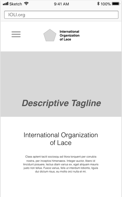
Navigation for mobile design was addressed in a couple of comments. We had not attempted mobile design yet because we were not able to budget for it at this stage. When discussing mobile navigation, we thought that a hamburger menu would work best. Look for this design mockup in the future.
There are also a few things that we will not be addressing this redesign. As far as changing the color from grey tones, at this point we are not ready to choose a color scheme. Traditionally, in the UI/UX design process, color and images are not added in the mockup until the final product is ready to be presented. This keeps the testers from getting attached to the design before the kinks in the layout are solved.
There was also a comment about a “bar/image” being too large. We were not sure what this was referring to, so we would need some more clarification before we can address this.
Some comments addressed testing methods, which we would definitely move forward with if this was a real usability test; however, they are not required for this assignment. One such suggestion would be to use personas. We thought that this was a great suggestion for usability testing on the website we are redesigning because it has a definite audience that it is trying to reach. We also liked the idea of using a card sorting method to verify the navigation options. It would work well in this scenario. If we were doing usability testing for this site in real life, we would implement these methods.
In term of suggestions to address in our redesign, there were many that we agreed with. The first addition to our redesign will be showing off images of members’ designs in a slideshow and having each image link to the respective pattern. We thought this was a great idea.
Another suggestion we liked was removing the Contact tab and including a contact link in the About tab, as well as adding the information to the footer of the website. This will also be included in our next redesign.
Finally, we will add breadcrumbs for when the user starts getting into the subpages of the site.
Navigation for mobile design was addressed in a couple of comments. We had not attempted mobile design yet because we were not able to budget for it at this stage. When discussing mobile navigation, we thought that a hamburger menu would work best. Look for this design mockup in the future.
There are also a few things that we will not be addressing this redesign. As far as changing the color from grey tones, at this point we are not ready to choose a color scheme. Traditionally, in the UI/UX design process, color and images are not added in the mockup until the final product is ready to be presented. This keeps the testers from getting attached to the design before the kinks in the layout are solved.
There was also a comment about a “bar/image” being too large. We were not sure what this was referring to, so we would need some more clarification before we can address this.
Some comments addressed testing methods, which we would definitely move forward with if this was a real usability test; however, they are not required for this assignment. One such suggestion would be to use personas. We thought that this was a great suggestion for usability testing on the website we are redesigning because it has a definite audience that it is trying to reach. We also liked the idea of using a card sorting method to verify the navigation options. It would work well in this scenario. If we were doing usability testing for this site in real life, we would implement these methods.
Next Redesign Iterations per Review and Analysis of Critiques
As noted above, there were several useful suggestions to address in our redesign that we agreed with. The first addition to our redesign will be showing off images of the members' designs in a slideshow and having each image link to the respective pattern.
Another suggestion we liked was removing the Contact tab and including a contact link in the About tab, as well as adding the information to the footer of the website. A similar suggestion was made to remove "forum" from the main nav and instead place it under Education/ Resources. We realized that we did not have a tab for resources on the original wireframe, so we added it here.
We decided to keep some callout buttons on the site, and just move the gallery button above into a rolling slideshow.
Not suggested, but something we thought of, was having social media links and a detailed list view of navigation at the bottom of the page. Contact information is also listed more prominently in the footer.
Another suggestion that we added to our redesign is breadcrumbs for when the user starts getting into the subpages of the site.
|
Another comment mentioned that mobile development would be crucial to most users, so we decided to address the navigation of the site, even though we were not able to address the rest of the site. When not in use, it will appear as a "hamburger" menu.
|
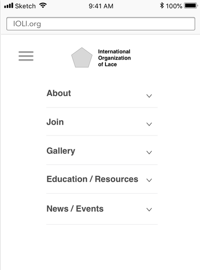
When the user taps on the menu, the options appear below.
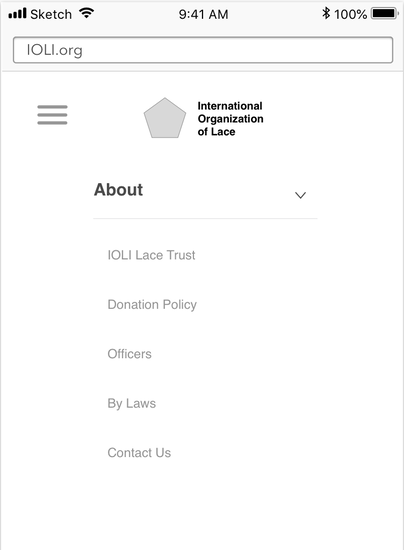
The user can tap on any of the menu items and a list of sub navigation items will appear.
