The following report was completed by Jillian Nickell for the Basket Lace team for the site for the International Organization of Lace (IOLI). Their site is located at: https://internationalorganizationoflace.org.
[3] Details of Tasks
Each member of Basket lace asked two common questions and then determined five more questions that they felt were relevant. The two common questions were decided because we deemed that they were important tasks to the average user of this site. We each completed two studies, one on desktop and one on mobile. Below are the two tasks; the common tasks are written in bold.
Find the duration of the video “Milanese Lace” by Louise Colgan, 2004.
Find the pattern for bobbin lace spider earrings.
Find the 2018 convention schedule for Thursday, July 26
Find the form for lace donation.
Tell me what the mission of this organization is. What do they do/why do they exist?
Find your local chapter.
What does one have to do to become a member?
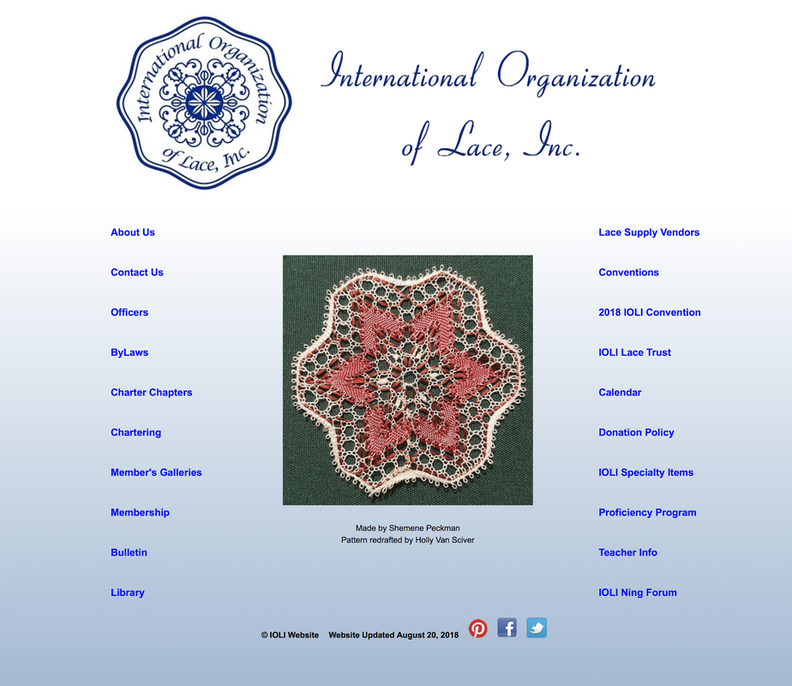
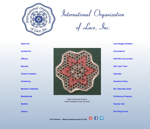
This report references the IOLI homepage and various links there. A screenshot of the home page is included below.
[4-8] What User Did/Did Not Do, Interesting/Surprising Findings, Potential Reasons for Actions
1. Find the duration of the video “Milanese Lace” by Louise Colgan, 2004.
User actions/non actions:
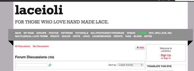
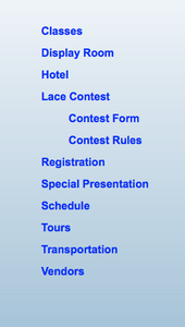
User studied the website and said she thought it might be located under teacher info on the right sidebar. When she did not locate it here, she hit the back button on her browser, noting that there was no global navigation on the top of the page as is standard now for most pages. She then clicked on IOLI Forum and clicked on “forum.” From here she navigated to the search bar and typed in Milanese Lace. Finding no luck here she then hit the browser back button.
Clicked Lace trust. Saw video tape library, but no link here to said library.
When she went back to the main page, she clicked a few other pages like Bulletin randomly, out of frustration, before she realized there was a link to Library. Here she noticed on the left that there were links to videos:
Upon clicking this, she was able to scroll down the page and find the video title. There were not a lot of titles overall, so she was able to find it quickly, but she said that there was no search function here for her to find what she needed quickly.
User said that the library link did not stand out to her, she did not notice it right away, and that the links seemed disorganized. Her observation was that she thought “library” seemed more appropriately grouped with “education.”
Potential reasons:
My theory is that the global navigation was missing and extremely disorganized. There are links from the home page but they’re all the same weight and importance, and some could be grouped together to make finding certain categories faster. I also think the “lace trust” page could have had another link to “library” since it was mentioned here.
Interesting findings/surprises:
I hadn’t considered that “teacher info” and “library” ought to go together and this was an interesting observation on the part of the user.
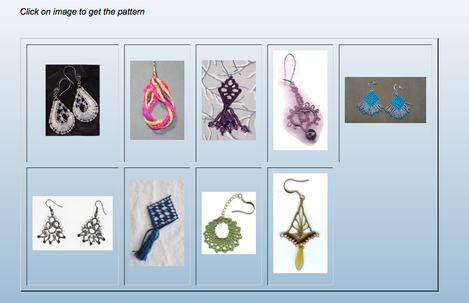
2. Find the pattern for bobbin lace spider earrings.
User actions/non actions:
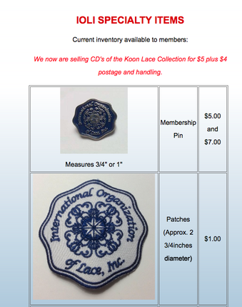
Stopped and scanned the site for relevant information. First clicked on IOLI Specialty Items, saying aloud that she thought they might sell it here.
When she didn’t find patterns here she hit the browser’s back button. She clicked on Chartering but quickly hit the back button upon realizing this was for clubs. She hit Lace Supply Vendors, she said, for the same reason she clicked specialty items - thinking maybe they’d have patterns for sale here.
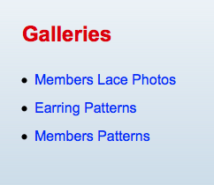
Finally, she clicked on Member Galleries, which took her here:
She clicked on members patterns. When she didn’t find it here she navigated back to the Galleries page, noticed that there was a specific category for Earring patterns and clicked that. However, she still had difficulty finding the right one, as none of them were labeled.
She had to randomly click each one until she found the spider earrings.
Potential reasons:
There are several categories that patterns could conceivably be located in. Patterns could be for sale or they could be an educational resource. Galleries, according to the user, were perhaps just photos of nice things people had made. In addition, member galleries were disorganized. It seemed odd that “earring patterns” and “member patterns” were in two different places. It would make more sense to have it all in one gallery and have it be searchable and have filters available to screen out certain results.
Interesting findings/surprises:
I had thought maybe she’d click on library (not that it was the correct place to click). I also was surprised that Members Patterns stood out to her before Earring Patterns.
3. Find the 2018 convention schedule for Thursday, July 26.
User actions/non actions:
Read the options aloud, said “I see Convention and 2018 Convention, so I guess I’ll click on 2018 convention.” She clicked on 2018 IOLI convention. Once she got here, she scanned the page, and noticed there were a series of links on the lefthand side.
From this, she chose Schedule. When she clicked it, she got to this message:
She clicked the schedule hyperlink which brought up a one page pdf, where she was able to find the time. However, she noted that it confused her that there were two different links for 2018 convention and convention. She also expressed irritation that once she clicked on convention schedule, there was another step for her to get to the pdf, instead of taking her straight there.
Potential reasons:
I think it was easy to see convention straight away in the links and it didn’t take her very long to find the schedule at all, it just had a few extra clicks for her to get where she was going to go. The only reason she was able to distinguish between the two links was because one of them said “2018.”
Interesting findings/surprises:
The user had some good observations, and I wasn’t actually aware that you when you had to click schedule it took you to another link to get to the schedule.
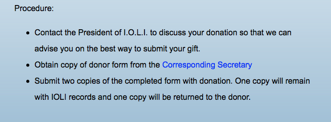
4. Find the form for lace donation.
User actions/non actions:
The user clicked on donation policy from the home page. She scrolled down but said nothing popped out at her. So she clicked the browser back button and went back to the home page. From here, she clicked Contact Us. Did not find it here either, so she returned to the home page. She tried the donation policy link again, and studied it more closely. She noted that there was an email link at the bottom of the page where you had to click to be able to contact someone to get the form.
She expressed irritation that there wasn’t an online interactive form that she could submit, instead of having to email someone to get the form and probably having to print it out, scan it, and then send it back.
Potential reasons:
I don’t think she saw this link straight away because it’s small and located below a wall of text.
Interesting findings/surprises:
The email link is another step making it difficult for people to donate, and I noted that the user found this irritating and cumbersome. It’s also interesting that she didn’t see this link right away.
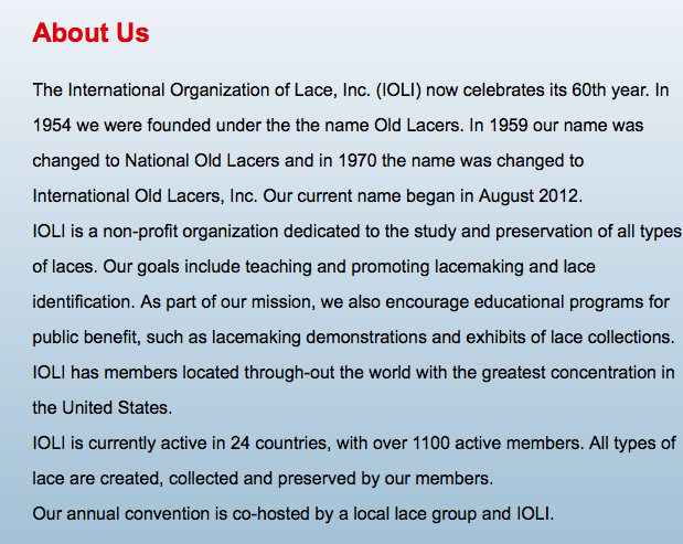
5. Tell me what the mission of this organization is. What do they do/why do they exist?
User actions/non actions:
Was able to click right away on the “About Us” link. She read aloud "the study and preservation of all types of laces and to promote educational programs.” She said it was not immediately clear when you land on the page exactly what they were - it was obvious they like lace, but had to click about us to find out. But she did not get stuck anywhere on this task.
Potential reasons:
About us is fairly easy to see and does not include any hidden information or secondary links to click on. User only seemed confused about the front page - there probably needs to be a better tagline, like in the “don’t make me think” and “rocket surgery” readings.
Interesting findings/surprises:
I think it’s interesting that the user was able to find this information straight away as opposed to some of the other info. Most pages have an “about us” link, and this one followed that convention, making it easier for the user.
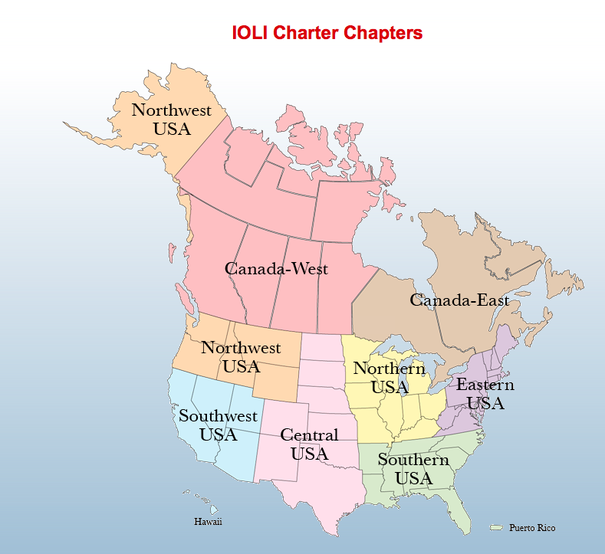
6. Find your local chapter.
User actions/non actions:
Took a moment to scan the page, then clicked on “charter chapters.” She was able to click on the map:
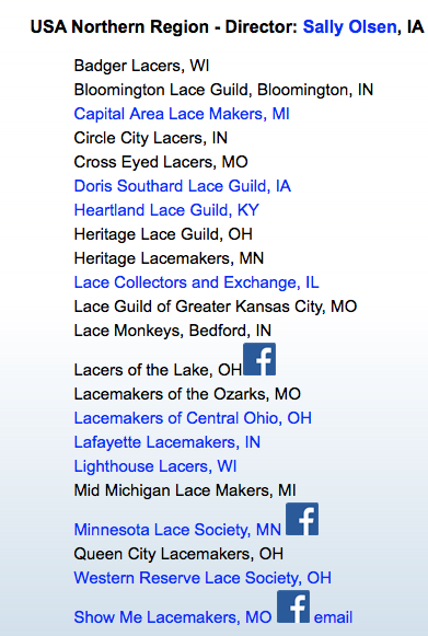
She was then able to click on “Northern USA” but said it was odd that Illinois was included in “Northern USA” - a lot of the chapters could be really far from her. Upon clicking this it shot her down to the section for Northern USA. She noted that not all chapters had a clickable link. Once she clicked on “Lace Collectors and Exchange, IL” it took her to another page. She said that it was not obvious to her where exactly in Illinois this chapter was located, and would it be near her if she wanted to go?
Potential reasons:
While the map is an interesting idea, it is confusing about where exactly each club is located. It simply says “Illinois,” and does not include the city. It might be better to have clickable links for each one too, even if it just takes you to a facebook group. This could be frustrating if you wanted to find more info out about your local chapter.
Interesting findings/surprises:
Did not think about the fact that the guilds don’t have their city listed, only the state, and this is definitely confusing.
7. What does one have to do to become a member?
User actions/non actions:
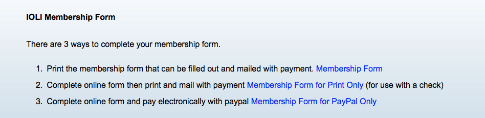
User clicked on Membership. She scrolled to the bottom of the page to find “membership form.”
She followed the steps listed above. When asked why she knew that this is where that information was located, she said that the blue links stood out right away.
Potential reasons:
Membership is clearly marked on the front page. Blue is usually recognized as a link, and it does pop more than anything else. This could probably also be achieved with a button of some kind instead of just blue text.
Interesting findings/surprises:
This might have been the quickest task, as this user seems to be used to just scanning pages for information.
[4-8] What User Did/Did Not Do, Interesting/Surprising Findings, Potential Reasons for Actions
1. Find the duration of the video “Milanese Lace” by Louise Colgan, 2004.
User Actions/non actions:
User talked through her reasons throughout the test. She said that she was looking at the blue links, looking for something that said “video.” It was hard for her to read (because it’s a mobile site).
You can see from above the approximate size on a mobile device and that it was difficult to see individual links. She had to pinch/zoom to be able to see all the links. First she went to member galleries, reasoning that there might be a video gallery here.
From here, she returned to the home page and clicked uncertainly on conventions, proficiency program and teacher info, just clicking stuff randomly because she was unsure of where to find videos.
Finally, she stopped and scanned the homepage and found Library. She had to “pinch and zoom” to see the menu on the left hand side:
The user told me that this task confused her, because she thought educational videos should be a part of the site that you could watch if you wanted to know how to do stuff (like youtube videos), and that’s why she went to Gallery first. Library was not the first place she thought to look.
Potential reasons:
The user’s explanation made total sense as to why she thought there might be a video gallery to me.
Interesting findings/surprises:
The idea of an embedded video gallery is actually a pretty good idea that I hadn’t even thought of.
2. Find the pattern for bobbin lace spider earrings.
User Actions/non actions:
The user took a moment to re-read navigation. She clicked on membership galleries - member patterns. She noted that the patterns were not labelled and that this made it harder to find.
After clicking on a few of them, she went back to the main gallery page and noted that there was a separate link for earring gallery vs member gallery, which she found confusing.
Once she got to the earring gallery again, she also noted that on the mobile site that it was hard to keep your place and she got lost “pinching and zooming." She also noted that there is no menu at the top of the page and the back button doesn’t work, and that the return to home page button is hard to find on mobile. This site is really designed for desktop and is not mobile responsive.
Potential reasons:
There are several categories that patterns could conceivably be located in. Patterns could be for sale or they could be an educational resource. Galleries, according to the user, were perhaps just photos of nice things people had made. In addition, member galleries were disorganized. It seemed odd that “earring patterns” and “member patterns” were in two different places. It would make more sense to have it all in one gallery and have it be searchable and have filters available to screen out certain results.
I also think that this a problem with mobile overall - many of these solutions could be applied with a more mobile responsive design.
Interesting findings/surprises:
It’s not really surprising exactly, but it really was obvious just how poor this site is working on a mobile site. The poor organization and labeling was just exacerbated by having to pinch/zoom and getting lost.
3. Find the 2018 convention schedule for Thursday, July 26.
User actions/non actions:
The user noted that it was unusual that there were two different links, one for 2018 convention and another just for “conventions.” She found the “schedule” link on left side of screen.
However, instead of clicking schedule she accidentally clicked on tours because the link was too small. She noted that it was weird that once she clicked on “schedule” there is ANOTHER link to click on for SCHEDULE. Said it was weird to read a pdf on a phone, and wished there was something more phone friendly to read.
Potential reasons:
Most of the same issues from User 1 came up with User 2 on this task, except that now it was even more complicated due to mobile screen size (clicking on the wrong link on accident because it was too small).
Interesting findings/surprises:
It’s interesting to note that the users get tripped up in the exact same place.
4. Find the form for lace donation.
User actions/non actions:
The user hit the browser back button to get back to the home screen. She noted a link for “donation policy.” She tried to click it but accidentally clicked a wrong link because links are so small. Found gift acceptance policy, found a “donation policy.” She said that there was a link to email, but there was not a set of directions or embedded form once she went to go donate - thought that was confusing.
Potential reasons:
There were actually directions:
But because on mobile it appears so tiny, I do not think the user was able to see these. Instead, all she noted was that there was an email link but that there wasn’t much besides that. I think having a form that’s mobile responsive would solve a lot of this confusion.
Interesting findings/surprises:
Mobile size is just making this task way more difficult.
5. Tell me what the mission of this organization is. What do they do/why do they exist?
User actions/non actions:
The user’s words: “From home page I have no idea what exactly they’re all about. They like lace! They are maybe nerds because there are conventions and patterns in the nav bar. They seem busy, they have bylaws about lace!” She then clicked on “about us.” The first paragraph says “why they changed their name”, which she noted seems irrelevant to the average person visiting the site.
She then had to scroll down another paragraph to find what they actually do and was then able to tell me what their mission was.
Potential reasons:
The home page has the name of the organization but no real catch phrase or photos of the goings on of the organization, which might help. The user also got confused when she had to read a whole paragraph about why they changed their name, which didn’t really seem relevant.
Interesting findings/surprises:
It’s interesting that this user stopped to read the first paragraph and noted that this information was kind of clunky, as opposed to the other user who skimmed right past it.
6. Find your local chapter.
User actions/non actions:
From the home page, the user zoomed in to left side nav. She said “Charter chapters?” After clicking on this, she found the map.
She then had to pinch and zoom to find her region. After tapping on “Northern USA”, it took her to that section, but again she found it difficult to read on mobile. She noted “What order are these in? If I want to find northern region closest to me, I don’t know which one is closest.”
She noted that they are alphabetized by first name of group, and not arranged by geographical order, which she said to her would make more sense.
Potential reasons:
I think that having the groups listed in alphabetical order does make less sense than in geographical order - like by zip code, for instance. I also think having a filter for your zip code and a listing of distance from your current area would make more sense than the map.
Interesting findings/surprises:
The user had a pretty good observation of the listings being disorganized.
7. What does one have to do to become a member?
User actions/non actions:
The user returned to main nav with back button instead of navigation button. She had to pinch and zoom to be able to read “membership.”
When she got to this page, she first saw benefits, privacy, then sees how much to pay, as she scrolled down the page. She noted that there is a lot of reading to do before you get to the membership form, instead of showing at the top of the page the option of enrolling in a membership.
Potential reasons:
Membership joining procedure probably does belong at the top of the page.
Interesting findings/surprises:
I hadn’t noticed how much extra info there was before getting to the link at the bottom of the page.
Review
[7] Surprising Findings
There were not a lot of extremely unexpected issues that came up. As expected, it’s a site with a very old design and is not mobile responsive, so I did expect the user on mobile to have some issues finding her way around.
I did do a “follow up” interview with each user just to see what their thoughts were on the site. They both noted that the navigation felt strange, unorganized and clunky. It was not arranged along the top of the site as most sites are nowadays, and it doesn’t “follow” you to different pages, so they had to continually hit the browser back button. They also noted that there were almost too many categories and information wasn’t thought of where it would logically belong. This was true of the main navigation as well as sub pages, like in galleries or just scrolling down to read pertinent info, like the “about us” page. In some places the information was not relevant, or not where they expected it to be, like the videos or the patterns.
I did like some of the user’s suggestions especially about organizing chapters - having a filter system by zip code and radius instead of a big map and disorganized list.
[9] Relation to Readings
Many of the concepts of “Don’t Make me Think.” For example, the title of the book basically says it all. If users have to think too much about where to find information, they’ll get frustrated and go away. Krug also touches on this in Chapter 5 with omitting needless words. He says that when you reduce needless words:
It reduces the noise level of the page.
It makes the useful content more prominent.
It makes the pages shorter, allowing users to see more of each page at a glance without scrolling.
This page definitely had a lot of extraneous information like on the Membership page - you had to scroll pretty far to get what you needed. On the “About Us” page - the information about why and how they changed their name didn’t seem relevant to the average user, and made the mission of the organization hidden, which is what most people come here for.
In addition, such as in Chapter 1 when Steven Krug has a flow chart from obvious to requires thought, the main navigation seems to require too much thought. . There are too many categories and the users seem to be constantly guessing at which one is the right one, especially with the video task.
Krug also makes the point in chapter 2 that we don’t read pages, we scan them. The hierarchy of this site makes it difficult to scan, especially on a mobile site. Most pages have a main navigation along the top with more defined categories, and this one definitely does not do that. It also does not, as discussed in Chapter 3, make use of conventions. One of the conventions that Krug talks about is where things will be located on a page, and most pages have a top navigation system. He also discusses visual hierarchy in this chapter, all of the pages could use a lot more hierarchy.
[10] Redesign Speculations
Overall information organization. This applies to main navigation - what category belongs with what category - but also on sub pages. For example, on the galleries page, there were three different galleries instead of one searchable one that you could filter. Or under the convention, you click on schedule and it takes you to another page… to click on schedule. There should not be that many steps to get what you need.
Remove extraneous information. There are some things, like in “about us” that users don’t care about or need to know, such as the name change. Or the “membership” page seemed pretty verbose and could have been trimmed down.
Better main navigation. There were too many categories and many of them were redundant - for example, the “Conventions” and “2018 conventions”, which could definitely be consolidated into one page. You could experiment with having a drop down menu and then having two versions - one for desktop one for web.
Better search and filter features for the chapters. It would be much better to be able to search the Membership page by zip code, as it’s unlikely anyone needs to see ALL of the chapters, and they’re not listed by geographic location but alphabetically within each region. It’s also confusing that there is no link to click on for some of them - at the very least, each listing should have an email of someone to contact and maybe an address of where to write, if they have no functioning web page.
Cleaner galleries with search features and clearly labelled images. None of the images were labelled in the regular view, it was just a square photo. The photos should have some kind of description below them before you click on them. It is also strange to have three different galleries. I think it would be better to have a filter - for example, only show earrings, or only show patterns - so you can narrow your search.
Better home page with a better overall design/tagline about what this whole page and organization is about. The main nav can be simplified and categories consolidated. Some stuff could be located on the same page, like membership, chartering, charter chapters, and bulletin. The main page could also be cleaner and just have a quick tagline that Krug talks about in “Don’t Make Me Think."
Mobile responsiveness. The user had quite a hard time using the mobile site, clicking on the wrong links because the text was too small. A lot of this can be done with CSS/percentage based layout and a frame that shrinks or expands depending on browser window. The menu could collapse to a hamburger menu when it hits a certain size.